
Quick Links
THE PROJECT
The goal:
We want to offer an app that delights freelancers and business owners by enabling collaboration.
The product:
Handshake app helps freelancers and business owners collaborate in real-time. It offers invoicing, worked hours tracking and budget estimates, as well as a messaging service.
The problem:
The app needs a clear interface which responds to both user personas pain points by providing helpful writing within the product.
Responsibilities:
After studying the personas, I created a style guide to guide my writing, then I adapted all the writing throughout the app (Headers, sub headers, components, tooltips, hint text, etc.)
Project duration:
July 15th to July 22nd
My role:
For this project, I worked on the UX writing to offer a delightful concise experience to users.
User research
The UX research team provided us with 2 personas which represent the two type of users which interact with our app.
Personas


User research: understanding the users
Tom - Characteristics
Needs clear guidance (simple steps)
Likes to work with people who work hard (focus on getting the job done)
Benefits from progress follow-up (highlight the real-time tracking feature)
Not into administrative tasks but fast learner (make tasks such as paying an invoice easy-peasy)
Doesn’t like to pressured (keep this in mind to offer flexibility around the app)
The choice of words to guide Tom in Handshake must be simple, to the point, offer assistance where needed and avoid situations where he might feel pressured.
Kelly - Characteristics
Kelly is unsure of her value (needs reassuring)
Very tech savvy but doesn’t like to share knowledge (tech-savvy but not patient)
Handshake recommended by sis (values opinions)
The choice of words to guide Kelly in Handshake must be clear, concise, scannable and efficient.
Informal Research
In order to better communicate with our users, I did some informal research to come up with lots of terms and words to define later the correct writing on the app.
Terms to define payment: Payment gateway, Automatic payment, Follow up of payment processing, Payment center, Progress tracker, Virtual invoice, Pay bills, settle invoice, Web payment system, Point of sale, Timesheets, Virtual estimate
Terms to define independent contractors: Freelancer, Independent consultant, Self-employed, Servicer, Contractor
Tagline early ideas:
- Spend less time on administrative tasks to put your energy where it really matters
- One stop shop for collaborating and getting the work done
- Work Better Together
- Do what you love and leave the rest to Handshake
- Working hard has never been so easy
Mapping personas emotions while using the app:
Excited (Kelly – easy way to get paid)
Happy (Kelly – easy way to track hours)
Uncertain (Tom – not tech-savvy)
Hopeful (Tom – that the app will help keep track of progress)
Surprised (Tom – that such a solution exists online)
Early voice brainstorming:
The app's voice should be friendly, informative, professional, smart, sympathetic, trustworthy, and welcoming.
style guide
I created this style guide after reflecting on the UX research and informal research. After getting the app reviewed by my team, I decided to change "payment gateway" to "payment center" to make it more understandable by users like Tom. I also chose to use "pay" instead of "settle" which is too formal for our users.


View the full style guide!
prototype
1. Common Screens
Before

After

My comments
Welcome screen: I brought the statement closer to the Handshake logo to make a link with the image.
Create account screen: I added a forgot password microcopy below the password field. This should direct the user to a reset password screen. I also added hint text below the second password field to help users choose a strong password and a learn more for which the “here” needs to pop a tooltip on why creating strong passwords is essential. I noticed there were no buttons to click once the info was added so I added 2 but they need to be linked to the other screens.
Choose role screen: I’m suggesting that the buttons have some kind of drop shadow to make it clear that they are buttons.
2. Business Owner Screens
Before

After

My comments
Project screen: I suggest adding a project duration field. I added a mockup to show where it should be.
Payment setup screen: I would suggest in future iterations to add a pop-up like the previous screen to confirm that the payment details have been saved. Inside this pop-up, a button would show saying “Next” which would lead the user to the invite collaborator screen.
Before
After


Lightbox screen: Adding a button to direct our users to the dashboard will help them understand what to do next.
Before


After
My comments
Project Dashboard: First, I want to point out that our users may be working on many projects at once. Perhaps the Dashboard could show the list of ongoing projects with a button for each which leads them to this screen? For this screen, I have added a checkbox for “Budget Declined” with a text box for the user to write comments or propose a revised budget. I have also added microcopy under each choice to provide extra info. In future iteration, it would be great to add a tooltip “What’s this?” with the microcopy text. When one box or the other is checked and the button “save my budget changes” is clicked, 2 things should happen: an email or alert is sent to the freelancer to inform them of the business owner’s choice. Secondly, a pop-up would help acknowledge the saved changes. It could say: “Your budget selection has been saved and shared with your collaborator” with a button below which says “Got it!”.
Time Screen: I suggest to add a button at the bottom “Go To Payment Gateway” for easy access (because that’s where they’ll need to go next ;)
Pay screen: I have only added a bit of microcopy to bring extra info to the user. I would suggest that when the user clicks “Settle”, a similar screen as preferred payment method appears so they can confirm how they wish to pay. On that new screen, at the top would appear this heading “You are about to settle $XXX.XX”. Right below, “Preferred payment method: XXXX.” Then under, a sub header “Change my preferred payment method” with a button next to it “Change” that would guide them back to the preferred payment method screen. Finally, at the bottom of this new screen, a button “Confirm Payment”. Once “Confirm Payment” has been clicked, it could flow back to the payment confirmation bubble screen.
Payment confirmation screen: I have removed the cancel button because once the payment has gone through, the user technically can’t go back (and shouldn’t! We don’t want them making the payment twice!).
Before

After

My comments
Messages screen: I’m wondering how our users get to this screen? I’m guessing this could appear on our new dashboard :) My second reflex was that unread messages should be the first thing users see because if they are about to write a new message but the answer is in that unread message, then they will waste time (and our users love their precious time). So I reversed the order by putting the inbox at the top and create a message at the bottom. I have added a filter to the inbox to
find messages relative to a particular project. Below, I added a sent messages tab because technically, if you send a message to a collaborator and he doesn’t respond, where would the sent message appear? Finally, I drafted a box around the inbox to apply common region and proximity to delimitate the inbox from the create a message fields. These are all suggestions and can be discussed later if you prefer! Food for thought: How do users delete & archive messages?
Message details screen: I placed the back button at the bottom to keep it consistent for users. Restructured the order of elements.
3. Freelancer Owner Screens
Before

After

My comments
Project screen: I believe the information should be the same as the business owner’s screen. The budget aspect can be configured later in the user flow in the project dashboard screen. The most important thing to keep in mind is that some business owners might not be tech-savvy so it would be great that the freelancer can enter all this info based on a previous conversation with the business owner and save time for their collaborator. As a freelancer, it is more likely they can complete this step easily.
Payment setup: I added microcopy to explain how we keep the bank details secure and how we charge the 1% fee. This can be adapted depending on how we will charge the 1% fee. Is it going to be a statement to be paid or taken within the amount of deposit?

Before
After

My comments
Project Dashboard: My first thought is the same as for the business owner, there needs to be an extra screen prior which would be a dashboard listing all projects as a freelancer might be working on many at the same time. The project description icon is not easy to understand for the user. I have replaced it by a button “View Project” for easy understanding. The text next to the check box “Budget is approved by client” should be ideally automatically synchronized with the status of the budget. Example, if the budget hasn’t been approved, the checkbox is empty and the text would be “Budget to be approved by client”. I have added a “Save budget details” button because there was no way to save.
Timesheet Screen: I have added fields for entering the worked hours info to make the process easy for our user. I have also added a field for the dates of the week.
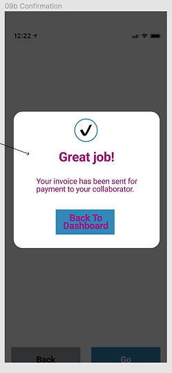
Pay Screen: I have added invoices numbers. It is something that we need to discuss as a team but technically, we need to choose when worked hours become invoices in the user journey. Since we know the business owner is going to want to keep track of the worked hours compared to his budget, we really need to be careful at which point those hours are translated into invoices. I suggest adding a Remind button to send a reminder to pay to the business owner but this could be in a future iteration.
Confirmation screen: I added a “Back to Dashboard” Button for easy flow of the user.
Messaging Center & Message detail: My changes are the same as the screens on the business owner side.
General Comments to Product Manager and UX design team
Fonts: To keep consistency and increase readability, I have made the following changes:
Header1: Roboto 30px, Bold
Header2: Roboto 24xp, Bold
Sub headers: Roboto 20px, Bold
Buttons: Roboto 22xp, Bold
Tooltips: Roboto, 12xp, Regular
Input field text: Roboto, 18xp, Regular
Body text: Roboto, 20xp, Regular
-
The alignment seems unusual on certain screens.
-
We should consider adding a help icon to all screens to direct the user in case they have issues or need support.
-
When a user signs in, he should be brought directly to the project dashboard because he most likely already completed the other steps.
-
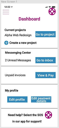
The project dashboard should have a “Create New Project Button” and a list of ongoing projects. I made a mockup in page 5 of this project and I would love discussing it with you!
-
I would suggest to add a stepper for the first time user account configuration screens to help them understand where they are in their journey.
-
We need to consider if our app will generate invoices and if so, this should be added in some of the screens. I have added where I think it would help the user in the screens.
-
I think a navigation menu would be helpful for users to navigate where they want from any screen (the top left corner 3 bars navigation menu).
-
We need to add a way for users to get to the Message Center. Maybe from the project dashboard or in the navigation menu?
-
To increase negative space and readability, tooltips microcopy text from screens “project dash, time & pay” should be hidden by adding an icon next to each (Budget approved, Budget declined, unpaid invoices, total payments, estimated budget and estimated hours) then the tooltip would appear when the icon is clicked. I would suggest a question mark in a circle but I’m eager to hear your suggestions for the appropriate icon.

As mentioned previously, the app would need a clear dashboard for users to navigate easily to the message center and view their different projects. Here is a sketch I made with all important elements users need to have access to. I have also added a Support icon to help users along the way.
iterations after design/writing critic
Comment 1 from UX writing lead: We need to use the first screen to show the benefits our app brings to users.
My edit: I added text below the logo that focuses on the user benefits. I moved the tagline below welcome and made it smaller so the focus goes to the benefits and the next step.
Comment 2 from UX writing lead: The best practice is to label fields outside of the box and provide hint text inside or just below the field. The reason is that you don't want the label to disappear as soon as the user clicks in.
My edit: I applied this best practice through the app by iterating and placing the labels above and hint text if necessary inside the field.
Comment 3 from UX writing lead: Make sure to keep your word choice consistent. If we use "Sign in" in the label for these fields, we'll want to make the button consistent with this as well.
My edit: I iterated and uniformized all buttons to keep them consistent throughout the app.

Before

After
Comment 4 from UX writing lead: This is an interesting choice for your role. I think "Consultant" would need user testing to see if your audience would relate to it. The consulting industry is pretty specific. Freelancing might cover a lot other work that does not fall within a consulting basis. What if a restaurant wants to hire a baker on a freelance basis to make cookies for their restaurant? They wouldn't be a consultant in that case.
My edit: After further review, I have switched consultant for freelancer to apply to a wider array of users (e.g. baker)
Before

After

Comment 5 from UX writing lead: Even though "Your name" seems so simple, it's deceptive. Be sure to include hint text or change the field label so users know whether a nickname is OK or if a legal name should be entered here. If you're not sure, you'll want to ask the Front-End Developer or the Designer what the "Name" field is used for. (Personalization? Invoicing? Taxes?)
My edit: To make this field more clear to users, I have added hint text inside the field for users to provide their full name.
Comment 6 from UX writing lead: Project description field - Imagine the types of questions users would have here: --Who sees this? --How much detail should I include? --Does this text count as a legal agreement? You don't have to answer everything, but use your hint text to point users in the right direction. Add a tooltip if you need to include even more info at this step. An example might be: "Enter your goals and major due dates for your consultant."
My edit: To better explain what this field is for so the user has a clear understanding of what needs to be inputted, I added hint text which explains what to add in the field.

Before

After
Comment 7 from UX writing lead: Look across these setup screens and notice that these setup pages are not all using the same content pattern for the page headings. Some are questions and some are instructions. It's best to make all setup steps parallel by using only instructions or only questions.
My edit: Although I like the question format for this step, the UX writing lead has a good point as my headers are not parallel. I have decided to go with a actionable statement for each step to keep things consistent.

Before

After
Comment 8 from UX writing lead: Because we're taking action on behalf of the user, it's especially important for us to provide more info on what happens next or how this works. So, you can add microcopy here like: "We'll send an email with a link to join your project. As soon as your consultant joins, we'll notify you." or something similar.
My edit: I totally agree with this one. I really like the way the text was written by the UX writing lead so I used that. I also caught a label inside the field and placed it above so it doesn't disappear when users type in.
Before


After
Comment 9 from UX writing lead: I like this button because it provides a way for the user to close this window! It just needs to be sentence case to match the style guide.
My edit: I have made this button sentence case as per the style guide.
Comment 10 from UX writing lead: Success messages are a great place to showcase the app's voice. You can be playful with the language and celebrate a job well done. These sentences are in the *passive voice*, meaning they can come across as robotic and impersonal. Additionally, words like "configure" are very tech-y and aren't the most friendly. Instead, you could use plain language and write in the active voice: "We set up your project and sent an invitation"
My edit: I am learning a lot from the UX writing lead. I will apply this best practice concerning passive voice in the future.

Before

After
Comment 11 from UX writing lead: Payment Gateway sounds a little too technical. Remember that Tom is not super tech savvy, so using a more familiar term here would help. Maybe something like Payment Center. You could also do some content testing of Gateway and ask users what their expectations are when they see "Gateway". That'll help you understand any confusion from terminology in the app
My edit: I have to agree with the UX Writing lead. Our users on the business owner side may not be familiar with the word gateway. I think they will interact better with "payment center" which I have used to replace this tab label.
Comment 12 from UX writing lead: "Settle" as a verb is typically used for disciplining children (Settle down!) or for really large financial transactions (1 million dollar settlement). To help make this sound more natural, use more familiar language like "Pay" or "Send payment"
My edit: As for the previous comment, I have to agree and to stay inline with the payment center, using the word pay is a nice way to keep the text consistent.
Comment 13 from UX writing lead: Amazing job with all of the consistent tiny text formatting, like currency values and dates!

Before

After
Comment 14 from UX writing lead: This used to be an hourly rate field. That's a pretty important field for a freelancer. It's much easier for a new freelancer like Kelly to set a rate and THEN calculate a total budget based on that (OR Handshake could do the auto-calculation for her). I'd recommend doing some user research before you remove that field from the set up process
My edit: After reviewing the UX writing lead comments, I have to agree with their point of view. My initial thoughts where that this information was going to be inputted in the project dash screen but I strongly respect the comments received and until further user research can be done, I have restored this field.
Before
After


Comment 15 from UX writing lead: Great rewrite on this cancel message! It's very clear what actions the user is taking, and what will happen next. It's also always helpful to connect the language in the heading to the button to drive home the message quickly and accurately. Small note: no need to include the extra "Do you really want to cancel?" sentence because the message is already very clear without it.
My edit: I decided to remove the "Do you really want to cancel" because my cancel message was clear, as acknowledged by the UX writing lead.

Before

After
Comment 16 from UX writing lead: If consultants choose PayPal or Check, they wouldn't enter their bank details. You can ask the development team to see if this heading could be *dynamic* based on their payment preference (so if they choose PayPal, it would say "Set up your PayPal account")
My edit: To rectify this, I added Direct deposit and PayPal in the header. When the payment setup details are provided by the development team, I may suggest making this screen skipped if check is selected in the prvious screen as well as confirm if PayPal log in will be linked in this screen.
Comment 17 from UX writing lead: Great job communicating Handshake's fee! That's really important information that the original design didn't account for.

Before

After
Comment 17 from UX writing lead: Awesome work on this budget solution! It wasn't clear from the original version what the biz owner could do if there was a discrepancy. Your tooltips and revision field explain this process in a simple and effective way. You can also add links to any support content that exists online if the biz owner needs more info.
Comment 18 from UX writing lead: Try to keep buttons to 3 words max. Since this button is so close to the budget info, this could be simply "Save"
My edit: I have followed this advice and actually went through all screens to make all buttons more scannable.

Before

After
Comment 19 from UX writing lead: This is okay at summarizing what just happened, but you can take it further by thinking about what types of questions Kelly might have after sending a request: - What happens next? - When should I expect payment? - What can I do if I don't get paid right away? You don't have to answer everything, but putting yourself in the freelancer's shoes will help create more impactful payment experiences so Kelly won't be left guessing about when she'll see the deposit hit her bank account.
My edit: After reflecting on how a freelancer might feel at this step, I have decided to focus on reassuring the user that the invoice has been sent and that the collaborator will receive a reminder to pay the invoice.
Before

After
Comment 20 from UX writing lead: Good job cleaning up these screens! Many students also ask if the whole Messages UI can be redesigned to look more like a chat or use conventions like bold text for unread messages.
General comment from UX writing lead:
-
Really thoughtful suggestions and questions to the team! After putting the basics in place, go back through the interactions again and look for places where you might add legal text (By signing up you agree to our Terms of Service), and look for opportunities that might benefit from further research (like "settle," "pay," or "send payment" language).
-
Fantastic work mocking up the Dashboard view! I particularly like the in-app support widget.
-
Avoid using words like "click" or "tap" because they're not accessible. If someone uses Handshake on a smartphone, they won't "click" through the app. Users with disabilities might use voice commands or other assistive tech to navigate, so "click" isn't accurate either. "Select the icon for support" would be a much better alternative here.
key takeaways
What I Learned
Keeping words consistent. Sometimes, you may have a better word to complete a task but using the same words consistently will unable the user to rely on your writing as they know what to expect next.
When in doubt, always return to the basics by consulting user personas and pain points. Most of the time, answers will flow as you put yourself in the users shoes.
Critique is key to creating a better product. Every member of a team has a different perspective and interpreting and applying critique comments to my work will better the user experience.